
Predicting wind with pressure maps
Ever stared at a weather map and wondered if you’re looking at wind, rain, or the inside of a spaghetti bowl? You’re not alone. Pressure maps look intimidating, full of squiggly lines and numbers that scream “science.” But those lines, are basically the cheat codes for predicting wind. Once you get how they work, you’ll know when the next session is going to be smooth, gusty, or total chaos.
The invisible squeeze that makes wind
Pressure maps show the push and pull of the atmosphere. High pressure is where the air is heavy and sinking (sunny, stable, chill). Low pressure is where the air rises and moves outwards (cloudy, active, moody). Wind happens because air wants to move from high to low pressure.
Here’s the cheat sheet:
Close isobars = strong wind (get your smaller kite ready).
Wide isobars = light wind (hello foil or Netflix day).
Circles with “H” = high pressure, calm skies.
Circles with “L” = low pressure, action incoming.
Think of it like this: Mother Nature is trying to balance her own air supply. You just happen to kitesurf the chaos.
Highs, lows, and kite moods
High and low pressure systems control your session vibes.
High pressure (H): Air sinks, skies clear, and winds tend to be lighter but steadier. Perfect for chill freeride or foil days. Expect clear blue skies, stable thermals, and fewer gusts, unless you are near the system’s edge, where things pick up.
Low pressure (L): Air rises, clouds build, and fronts form. That is where you get punchy, shifting winds and fast weather changes. Ideal for storm chasers, less so for beginners still learning self-rescue.
Example: The North Sea loves these systems. A 990 hPa low moving in from the Atlantic? Expect 25 knots and messy skies by evening.
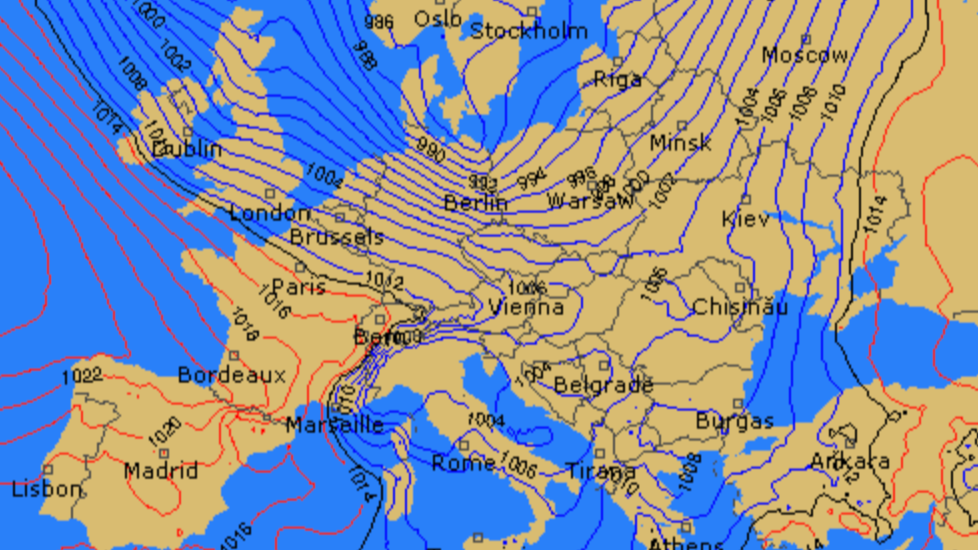
Reading those spaghetti lines without crying
Isobars are like contour lines for pressure. Each line connects points with the same air pressure, measured in hectopascals (hPa). The closer they are together, the faster air flows between them.
The trick is learning to read patterns:
Circular and tight = strong wind zone.
Elongated oval = broad area of wind.
Sharp bend = front or boundary.
Parallel lines = steady directional wind.
Follow the lines. Wind moves roughly parallel to them, not straight from high to low. In the Northern Hemisphere, it curves clockwise around highs and counterclockwise around lows (reverse below the equator).
So if you are kiting in Portugal and see a low-pressure system sitting offshore, the wind will usually blow from the north along the coast. Same chart, different hemisphere? Reverse it.
Pro tip: Most weather apps like Windy let you toggle pressure layers on and off. Play around with them. You will start recognizing patterns that your app’s basic forecast cannot explain.

Spotting wind direction like a pro
Wind direction on a pressure map follows the isobars, but with a small angle toward the low-pressure area (thanks to the Coriolis effect). That is why in Europe, winds around a low-pressure swirl counterclockwise and usually bring onshore conditions from the southwest. Around highs, the wind flows clockwise, often giving you offshore or cross-shore setups depending on your coast.
Example: In the Netherlands, when a low pressure sits west over the UK, it usually brings southwest wind, side-on for Noordwijk and Katwijk. Perfect wave-riding combo.
Use that info to plan sessions instead of just hoping the forecast holds. You will also start noticing when the wind will flip direction as systems move east.

When pressure means trouble
Pressure systems do not just create wind, they also bring weather drama.
Rapid pressure drop: incoming storm or squall. Do not be the hero who rigs a 9m in a 970 hPa system.
Sharp gradient (tight isobars): gusty wind and rough water.
Flattening gradient (lines spreading apart): dying wind, pack your foil or your patience.
A sudden 2 to 3 hPa drop within hours can mean a front is approaching. Pair that with rising humidity or darker clouds and you have got the classic “why did I even pump up” scenario.
Example: During stormy autumns in Northern Europe, lows can deepen fast overnight, flipping a mellow 18 knots into 35. Always recheck before you drive.
For more on storm safety and what those squiggly fronts mean, check out Predicting the perfect storm.
Using pressure maps for session timing
Pressure maps show the “why” behind the forecast. Combine them with local knowledge and you can predict when the wind will fill in.
Here is a simple workflow:
Check where the nearest high and low pressures are.
See which direction air is flowing between them.
Note the spacing, tight lines mean sooner wind, wide lines mean slower development.
Watch how they move hour by hour. A shifting low can change side-shore to offshore in half a day.
Example: A high sitting over Germany and a low over the UK creates a southwest airflow through the North Sea, classic steady wind setup for the Dutch coast. When that high drifts east, expect the wind to fade.
Tools that make it easy
You do not have to be a meteorologist, just use the right toys.
Windy: Toggle the pressure map and compare with wind arrows.
Met Office: Great for European synoptic charts and pressure animations.
RainViewer: Combine with radar for real-time fronts.
Once you compare the map with your session results a few times, you will start seeing patterns that apps alone cannot predict. It is how pros guess a windy afternoon before anyone else starts pumping.
Before you chase that low
Pressure maps turn chaos into strategy. They tell you where the wind is born, how strong it will be, and what direction it is likely to blow next. Combine them with radar and cloud knowledge and you are basically the weather oracle of your beach.
So next time someone asks how you always seem to score the best sessions, just smile and say, “I read the pressure.” Because nothing feels better than predicting the wind like a pro and proving your app wrong.
xox Berito